macOS Sonoma Menu Section Headers Look a Bit Off
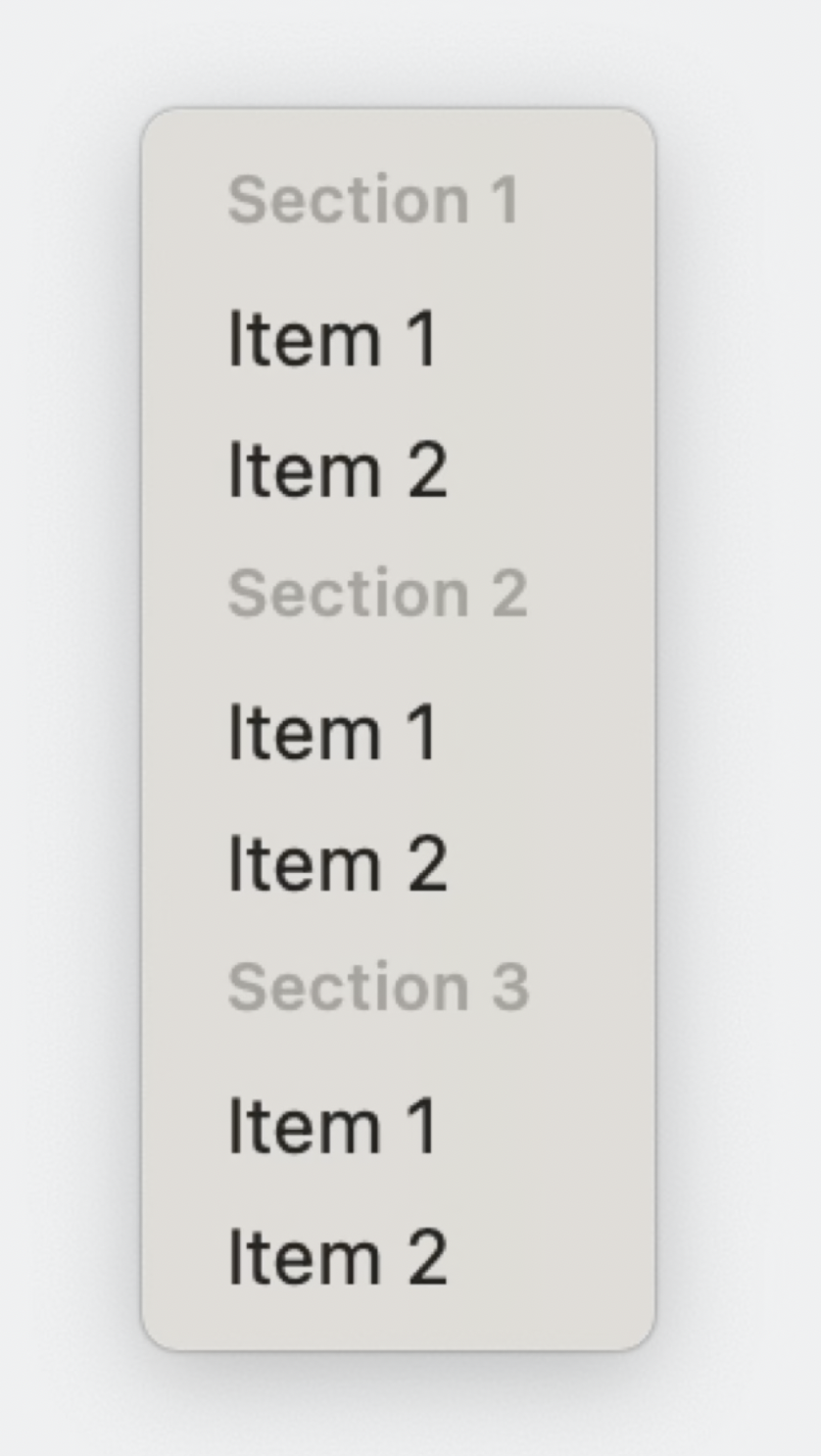
In my opinion, the new section headers of NSMenu don’t have enough top margin.
In the WWDC 2023 example, there are no “descenders” in the menu title typo of e.g. “Section 2”. (Descenders are e.g. the lower-case g or p going below the baseline.)
This increases the visual vertical distance between “Section 2” and “Item 1”. In other words, the “Section 2” title is further away from its section items than it is from the items above.
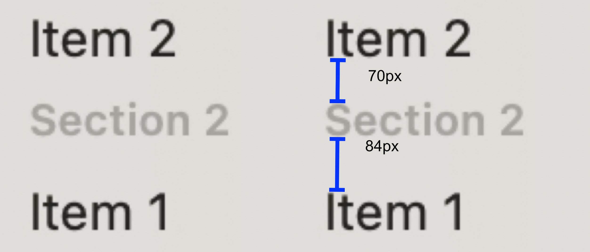
If I measure it in the picture, it’s ~84px down and ~70px up. Measuring distances from screenshots in videos isn’t ideal, but it’s a 20% difference, so it’s not just bad compression and anti-alialising.
This is absolute nit picking, but it’s odd that Apple went with smaller section heading font sizes without nudging down the baseline a bit more.
This effectively decreases the item height, it seems, too. This breaks the monotonous vertical rhythm of menus.
https://iamsteve.me/blog/a-guide-to-vertical-rhythm
But more importantly (to me), the vertical distances break with the Gestalt principle of “proximity”: what is close to each other is perceived to belong to each other. The heading should appear closer to the items below it.
https://www.nngroup.com/articles/gestalt-proximity/
Update 2023-06-12: Here’s another rough collage.
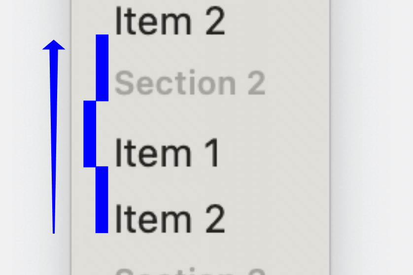
Measure the baseline distance between regular items. Continue up. You see that the “Item N” menu items do actually adhere to a vertical rhythm. The section heading’s baseline is too far up, but the “line height” (or rather: NSMenuItem height) appears to be the same, though.
So the rhythm isn’t broken overall. The headings are just offset a bit. (But in the wrong direction IMHO.)