A Visually More Accessible Disabled NSColorWell
I use the macOS color well to let users of The Archive tint vector icons in their favorite color. But setting NSColorWell.isEnabled hardly produces a visual change in the color editor.
Can you easily tell which is enabled and which is disabled if it weren’t for the checkbox?
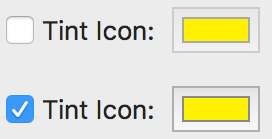
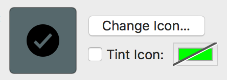
The little frame color change is too subtle for my taste. I added a high-contrast strike-through line to my color well:
Enjoy the code below:
class StrikethroughColorWell: NSColorWell {
    override func draw(_ dirtyRect: NSRect) {
        super.draw(dirtyRect)

        if !isEnabled { drawStrikethrough(rect: dirtyRect) }
    }

    private func drawStrikethrough(rect: NSRect) {

        let lightLine = NSBezierPath()
        lightLine.move(to: NSPoint(x: 1, y: 0))
        lightLine.line(to: NSPoint(x: rect.width + 1, y: rect.height))
        lightLine.lineWidth = 2
        NSColor.white.set()
        lightLine.stroke()

        let darkLine = NSBezierPath()
        darkLine.move(to: NSPoint(x: -1, y: 0))
        darkLine.line(to: NSPoint(x: rect.width - 1, y: rect.height))
        darkLine.lineWidth = 2
        NSColor.darkGray.set()
        darkLine.stroke()
    }
}