Atkinson Hyperlegible Font May Be Pretty Good If Your Granny Can't See Well
My grandmother is 91 years old and, for about 2 years now, her sight degraded to almost-blindness. She barely sees milky shapes in her central field of vision. It’s supposedly better in the corners of her eyes, but I couldn’t get any reliable confirmation out of her regarding that.
So using a telephone is a problem.
There’s a ton of phones for the hearing-impaired. And there’s phones for those with really bad sight. But I don’t really buy these claims from manufacturers. We’ve been through somewhere between 5 to 10 phones. I should probably list them here one day so you, dear reader, don’t have to try all the phones, either. It’s a road full of disappointments, I can tell you.
In the past, she memorized the number of presses on the “down” key that were required to scroll through her phone book to call someone. TAXI was at position 2, doctors at positions 3, 12, and 18 or so, I was at around 5. That worked remarkably well, all things considered. She couldn’t easily add entries to the phone book, though, because that threw the old order out of the window. And the display was garbage: black BG and white text at high resoltion sounded good, but font sizes were too small and selections were highlighted with a medium-red background and the same white font, effectively reducing contrast instead of increasing it (when you come from white-on-black, you can only get down from that 100% tonasl contrast). Using her b/w contrast loupe thingie and reading device, the result was a mushy gray. Could just as well not have a display at all.
Update 2021-02-05: Folks pointed out that I didn’t discuss voice assistants at all in this context, so I wrote a short follow-up why they are not an option if you’re curious.
My current quick fix for her needs: huge printouts. 72pt font, one line for the name, one line for the number.
With a quick mockup using my iPad and my father’s WiFi printer on premise (amazing how well that stuff worked together out of the box), the best thing I could whip up was Baskerville Bold, 72pt.
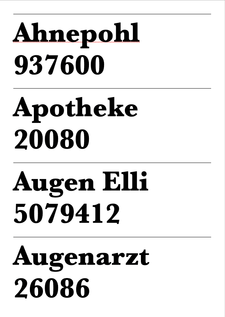
She approved of that design because it was rather big and rather black. It kinda worked for a test number or two.
Transcribing the whole phone book of hers, I looked for fonts expecially designed for people who have impaired sight. I know there’re fonts to aid dyslexic – where the line weights are somewhat unique and help differentiate the letters, though I don’t know how well these perform.
I did find the free Atkinson Hyperlegible Font by the Braille Institute of America, Inc., on the web, though. It looks unremarkable at first. I was worried because it’s a sans-serif, so I expected that it would perform worse than Baskerville becaus of the lack of shape hints in the serifs.
But I was wrong, she liked the font better, so we kept that.
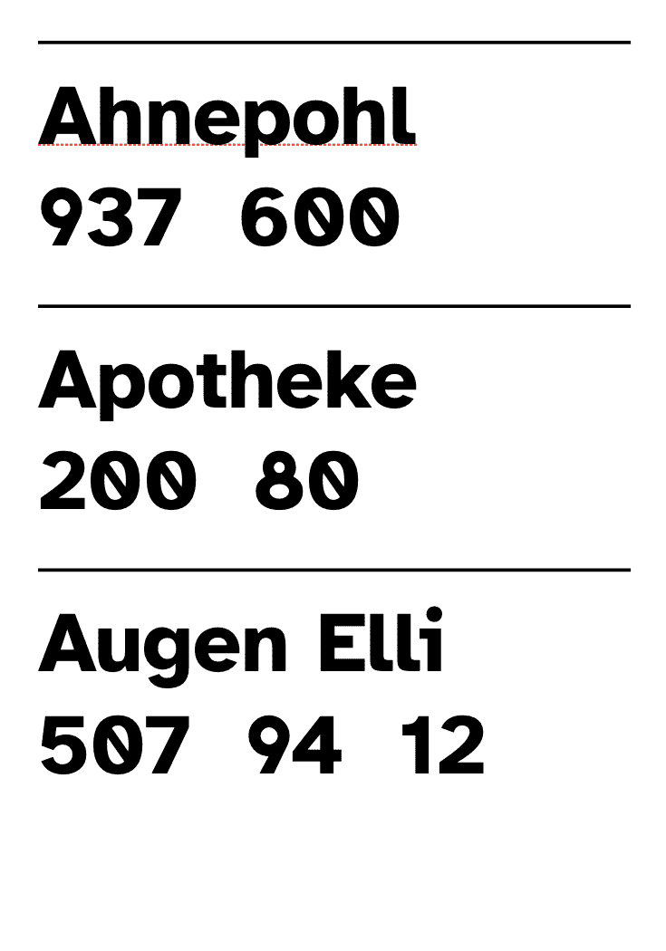
One nice thing the font features out of the box is a slash in the number 0. Numbers in general are designed to not all look alike. We’ll see how well that works after a couple of weeks. Muscle memory to hit the numbers on the phone is okay, and having a printout that she can even further magnify if needed beats the crappy phone displays any day of the week.
I can recommend the font. If you have someone with impaired sight, try it out in your printouts and see how it performs. Atkinson Hyperlegible Font is a free download. Thanks, Braille Institute of America!