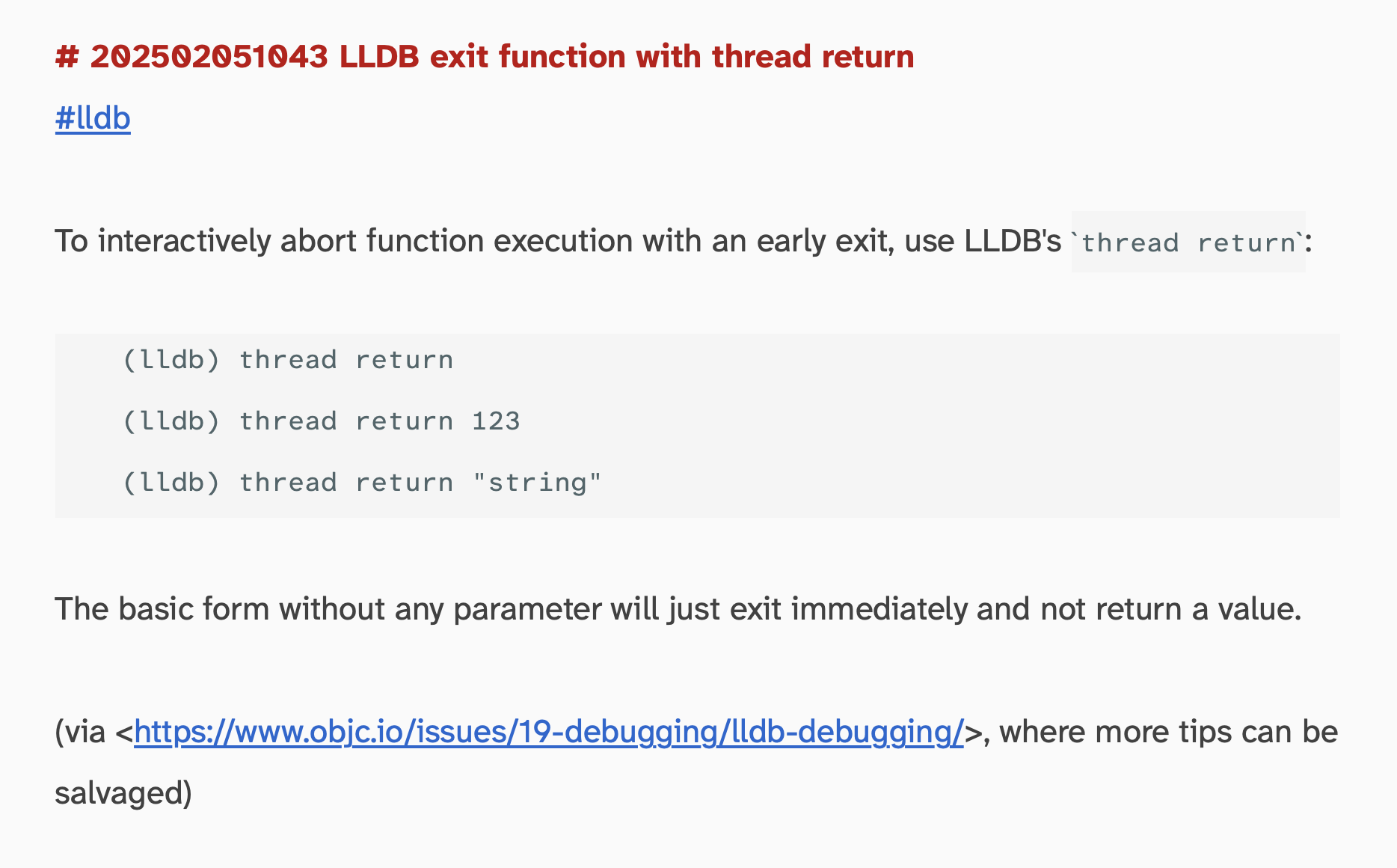
The Braille Institute released an update to their Atkinson Hyperlegible font. My late grandmother approved of its shapes, so check it out if you want to maximize legibility of all letters and numbers in your life. (And when do you not want to be able to read what you type?)
My grandmother is 91 years old and, for about 2 years now, her sight degraded to almost-blindness. She barely sees milky shapes in her central field of vision. It’s supposedly better in the corners of her eyes, but I couldn’t get any reliable confirmation out of her regarding that. So using a telephone is a problem.
In the original post about a cheap way to set the line height in a text view to, say, 150%, the result kind of worked but didn’t look that cool. One issue is that the extra line spacing was exclusively added at the bottom. With the following solution, you’ll get a proper line height with tastefully aligned insertion point and baseline and all.
NSTextView (and UITextView for that matter) have a defaultParagraphStyle attribute where you can set the text’s line height. That works swell – if you display text statically. Once the user can enter something, you can run into trouble: Update 2017-07:I posted a better version without paragraph style attributes that hooks into the NSLayoutManager delegate callbacks for a more consistent and speedy experience!
I like this interactive guide a lot, because it focuses on basic rules of nice-looking typography which result in a quite beautiful example page.
The reference to http://modularscale.com/ was nice, although I seem to fare well with a selection of the traditional scale: 16, 18, 21, 24, 36 (measured in pt; I use ems, though).