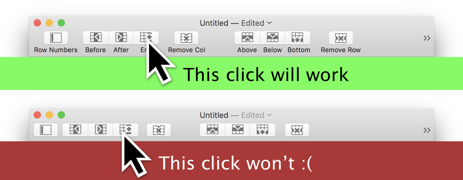
In this fourth and probably still not final part of my series on NSToolbarItems with segmented controls, I just want to share a problem and a quick fix that Nathan Manceaux-Panot brought up today. The series spans 8 years and is this: Nathan recently went through the series to implement segmented controls in toolbars but discovered that the overflow menu items would not enable (a validation problem) and when they enable, they don’t fire the action. When he brought this up today, I investigated.
Xcode and Safari sport Touch Bar items to navigate back and forth. Have a close look: When you put two NSTouchBarItems next to each other, there usually is a gap. Between the navigation controls, there is a mere hairline divider, but not the regular fixed-width space. They are not realized via NSSegmentedControl, though. Compare the navigation buttons with the system-wide controls far to the right: volume, brightness, play/pause. (I’m listening to the 1980s Pop Radio on Apple Music at the moment, in case you’re curious.) The system controls are a NSSegmentedControl. They have rounded corners for the whole control, while the navigation buttons have rounded corners for every button. Also, the navigation buttons have the default button width.
Two years ago, I wrote about how I implemented a toolbar with NSSegmentedControl, much like Apple’s own apps have them since macOS 10.11 Yosemite. Last week I discovered my implementation was buggy: it did not work at all when you customize the toolbar to show “Icon Only”, i.e. hide the label text.
This post is part of a series on getting NSSegmentedControl to work in your toolbars. Earlier this week I posted how to create a segmented toolbar item with 1 label for each segment. Now some options in TableFlip depend on context: without a selected cell, you cannot remove the selection, for example. So I disabled some segments and it looked alright:
Ever wondered how Apple Mail’s NSToolbar achieves the effect of individually labeled buttons shown in groups? Update 2018-11-23: I discovered a flaw in the target–action-mechanism of NSToolbarItems. They don’t fire if the label is hidden. This post’s approach is still valid enough, but is now part of a series of posts on the topic, with the 3rd one providing a fix: